3d Alphabet
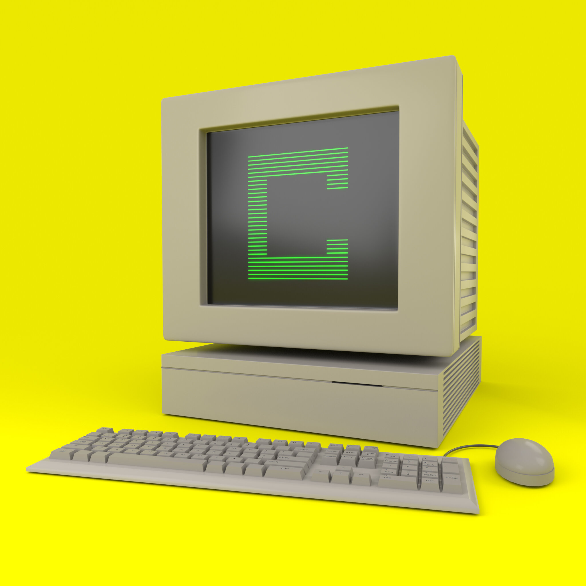
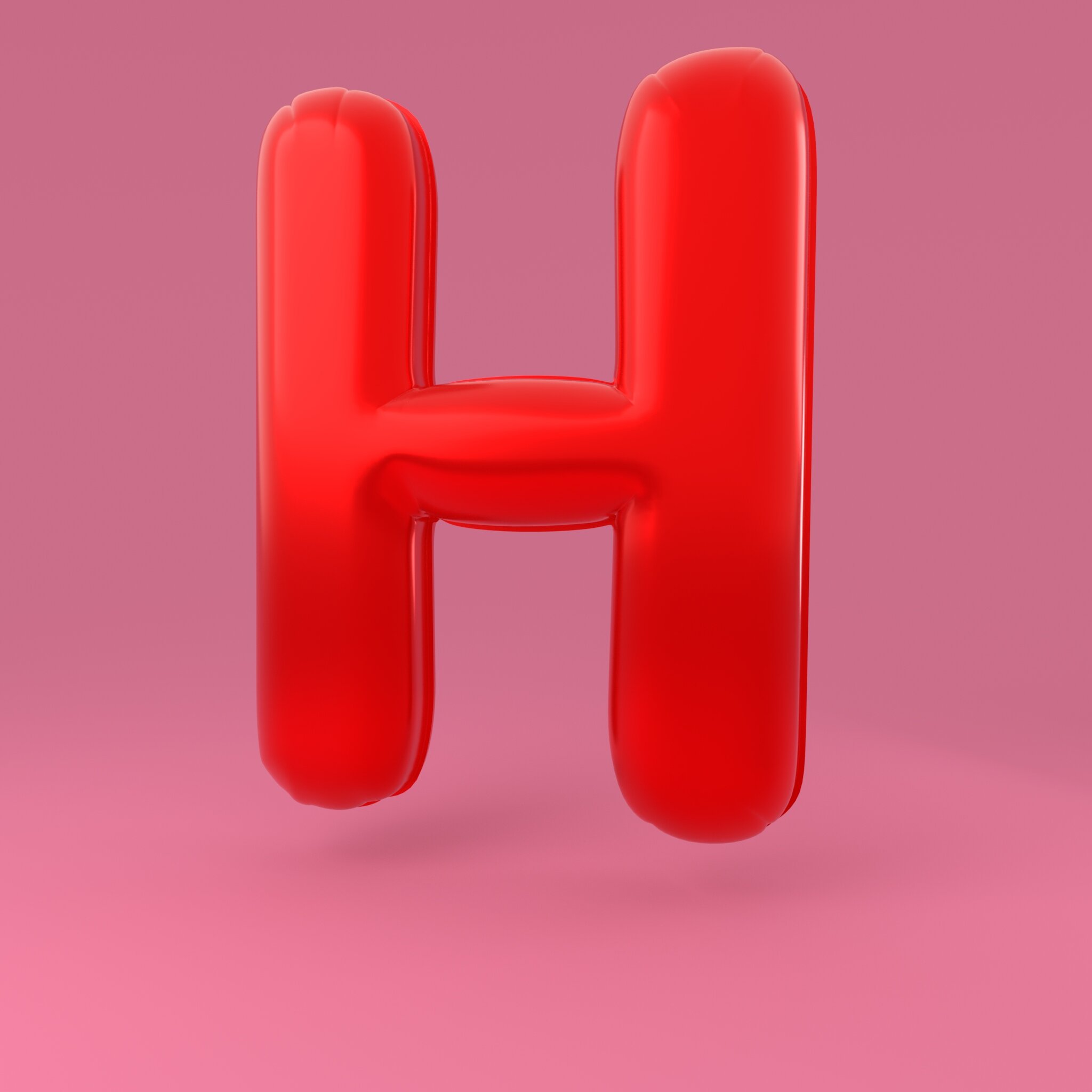
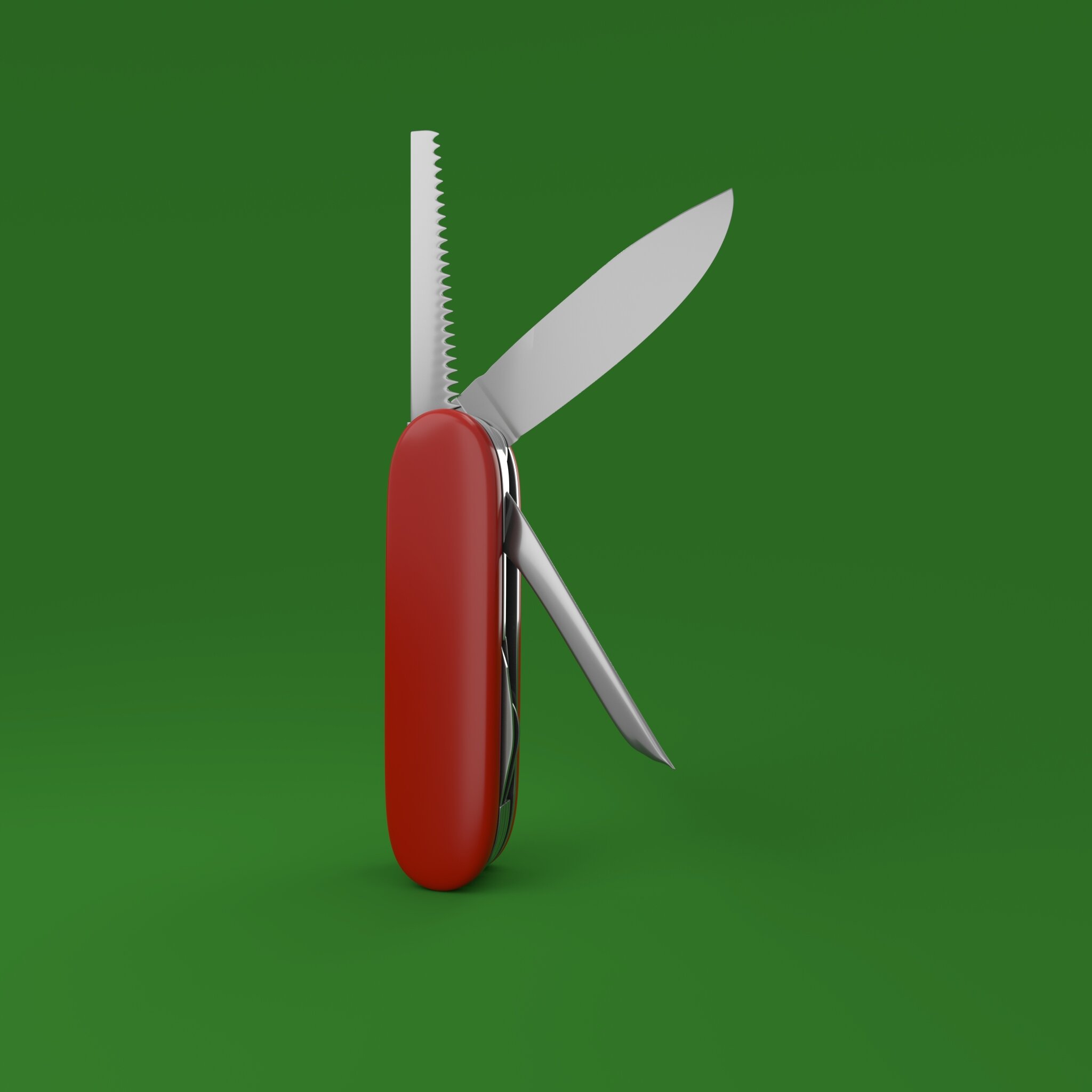
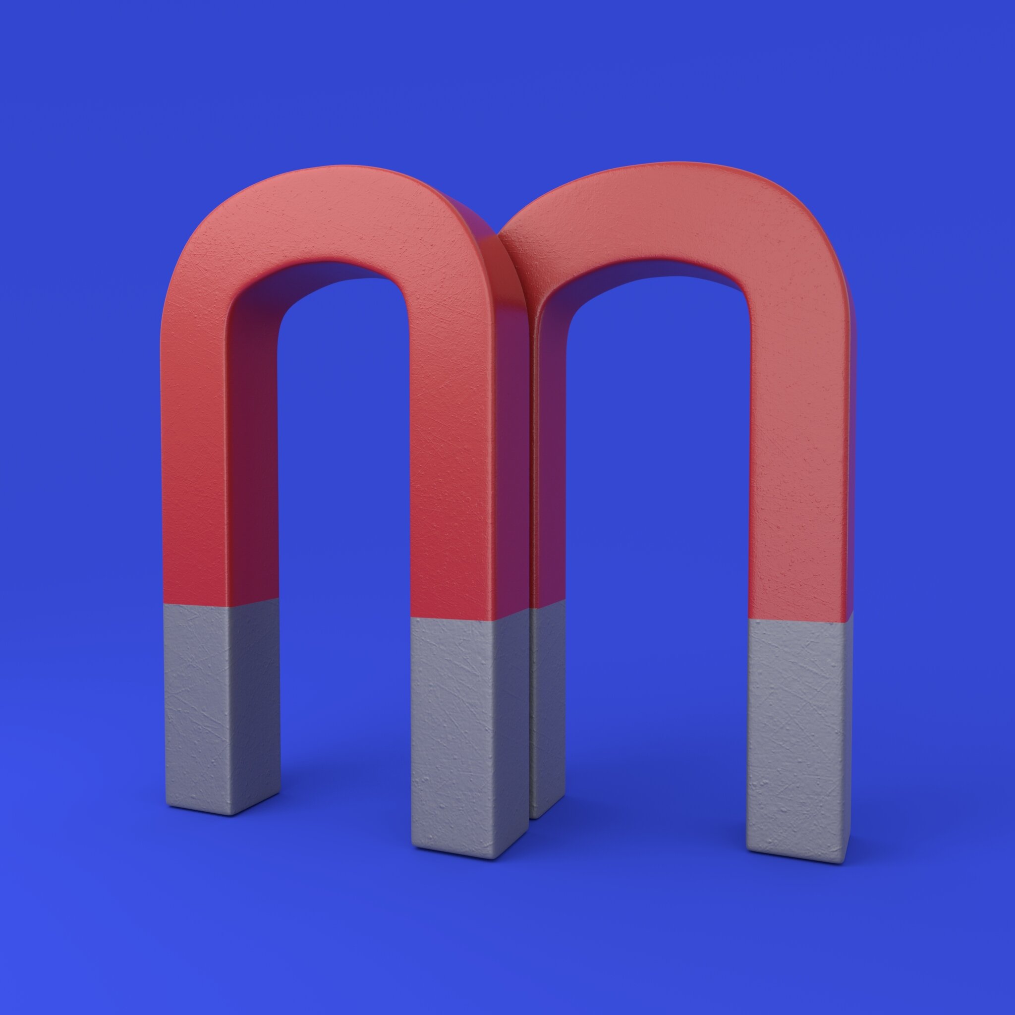
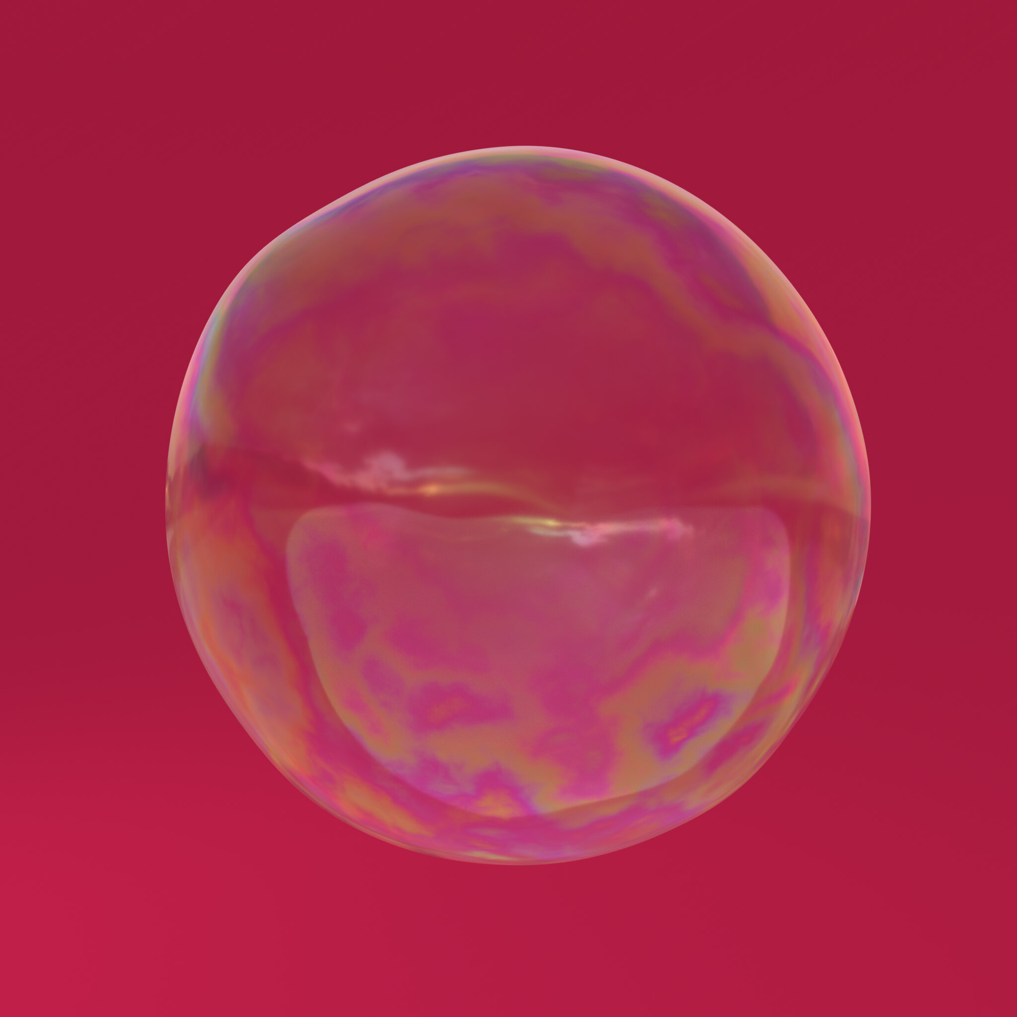
This project represents a play on connotative image making to create typography based on denotative images. This project worked as a personal study for creating realistic renderings and look development of assets in 3D space that convincingly create the individual and unique lettering. This project took over a year to create in my spare time and was originally part of the 36 Days of Type design challenge. Some assets were created completely by me and some assets were adapted from existing models. Images created using Maya and Arnold. Maybe some day I will add the 0-9 numbers but for now please enjoy my alphabet created from words that start with their letter. This project proved to be an excellent study for 3D asset texturing and shading with a multitude of unique materials.
Catch 21
Group Project Short Film
This is the story of an incessant gambler who had finally reached the end of his pitiful rope. He loses all of his winnings in one game of blackjack, all except a single chip. When he decides to bet the chip it begins to move and hop out of his hand. He follows the chip on a journey as he is literally consumed by his addiction. He has an epiphany and realizes that his real problem is himself . Once he has his realization he finally decides to do the right thing and walk away... Director/ Writer: Nick Manfredi nicmanfredi1993@gmail.com
Producer/ Lead Animator: Sydney Daugherty daughertysydney@gmail.com
Art Director: Liz Martin lizmcquaidmartin@gmail.com
Technical Director: Chris Ribar chrisribar@gmail.com Animator/ Modeller:
Hannah Sung xhannah93x@hotmail.com Sound Man/ Animator:
Carmine Indelicato minec4r@gmail.com
SILENCE OF THE SIREN
SENIOR THESIS SHORT FILM
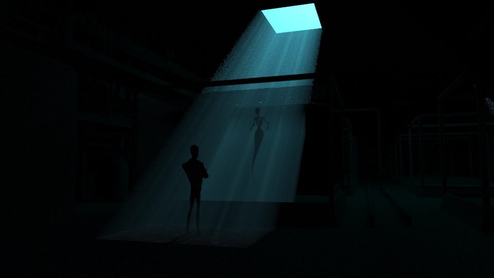
A 3D short animated senior thesis film created at the School of Visual Arts. The short is about the suspense between a man and his captive siren. As he tries to control her he slowly loses control of himself.
Directed by Liz McQuaid Martin
Story, Layout, Design, Modeling, Rigging, Lighting, Effects Compositing: Liz McQuaid Martin
Modeling: Ava Sawicka, Juan Macias, Kevin YuanZhi Chen, Meghan Pangiochi
Animation: Sydney Daugherty, Vasawat Changtroraleke, Meghan Pangiochi, Gavin Slyman, David O'Connor, Elizabeth Lee, Michael Deliso, Elaina Brilliantes, Cat McDonnell, Brian Kelso-GIllespie
Additional Lighting: Meghan Pangiochi
Rigging: Brett Taggart, Sydney Daugherty
Additional Set Dressing: Scarlette Thiele, Arielle Trenk
Additional FX: Monica Manalo
FILM FESTIVAL OFFICIAL SELECTION
The 5th Annual Kuandu International Animation Festival (KDIAF)
NYC ACM SIGGRAPH MetroCAF 2015
Conway Film Festival 2015
Kinematifest 2015
Animex International Animation and Video Game Festival 2015
BLOW-UP Chicago International Arthouse Film Festival 2015 (Student Film: Official Selection)
OZARK SHORTS
Beeston Film Festival
Slum Film Festival
Student Art Festival 2016, Orlando Florida (Finalist)
Balinale, Bali International Film Festival 2015
Malta Film Festival for Children 2016
Silk Road Film Festival 2016 in Dublin, Ireland
Cannes Short Film Corner 2015
International Animation Festival CHILEMONOS
River Bend Film Festival 2016
Detroit International Festival of Animation 2016
First Step Film Festival 2015
BFI Future Film Festival 2016
26th Mediawave International Film and Music Gathering 2016
12th NYC Downtown Short Film Festival
Mexico International Film Festival 2016 (Student Competition: Golden Palm Winner)
Zoom International Film Festival 2016
Kaohisiung Film Archive 2015
Krok Festival 2016
Cebu International Film Festival 2016
FilmQuest 2016
Stuttgart International Festival of Animated Film
Making OF 'Silence of the siren'
What goes into making a 3D short film? When you have to build everything from the ground up you start with an idea and then build and build until you have a world that unfolds in front of you. As with many creative ideas, the basis for Silence of the Siren struck me while I was in the shower. I was tired and grouchy, trying to come up with cute ideas for a 3D film for my college thesis. My mind was having none of it. I felt like an evil creature glaring at the tiles and started imagining myself in a fish tank glaring at whatever was watching me. I liked it. From there the idea grew into a silent and stubborn battle between two characters that were also having one of those days where they were also having none of it. This was my first major project where I was on my own as the director bringing concept from start to finish and this idea got me excited.
PREPRODUCTION
SCRIPT:
The first step in actually consolidating a rough idea is writing a script. If you are already starting to see camera angles and shots then you are in a good place! Below is a page from the original script for the film.
CONCEPT AND DESIGN
After you edit and share your script with trusted reviewers you begin creating the world these characters live inside. You need research and reference to help support your proof of concept as well as getting other people on board. You will need to create animatics, layouts, and previzualizations of every shot and if you don't have enough foundation in your concept the project can become disorganized, lose track, and fall short along the way. This doesn't mean there isn't room to be creative and take advantage of those 'happy accidents' that always end up occurring on a film project! But it does mean that you, as a director, have a clear vision and you can stay on track.
CHARACTER DESIGN
For Warren I knew exactly the type of character I wanted to create from the beginning. I wanted his stern and ridgid mind to come through in his character design and fortunately there are many amazing 'villian' characters I could use as reference that have those delicious cheek bones and jawlines that tell their story in just their faces. Below are two pages I collected to gather successful character designs that had similar themes to Warren.
It only took a few sketches to start seeing Warren unfold as a character. His face shapes ended up being really fun to light.
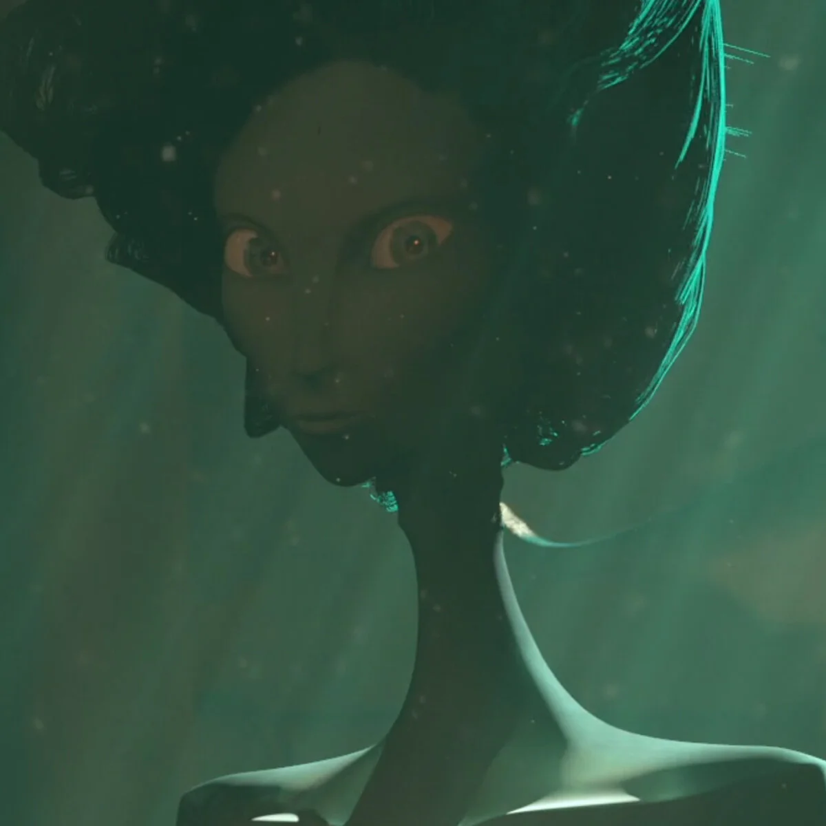
The design for the mermaid took a little bit longer. In my mind she was always shrouded in darkness but I needed to bring her out a bit more so she could have her own personality to contrast Warren's. I eventually ended up drawing inspiration for the design from some of my favorite animated films. Both served as excellent reference because there was both set lighting for the stop motion Corpse Bride and 3D lighting for Star Wars Clone Wars.
And here are concept images created in reference for the mermaid for this film. While the final design formed in the 3D sculpt for the memaid I can see pieces of the creature in the early concepts.
ANIMATIC
While the characters are being developed the story and camera still needs to move forward in production. I wanted my short to feel very cinematic so setting up strong compositions in the beginning stages was important. Animatics are one of the first and fastest ways to visually set to the pace and initial layout of the film. The idea was much rougher, as this was a student thesis, and there were actually quite a few changes to the shots from the animatic to the final version. But I enjoy looking back on the animatics because the stronger more cinematic shots made it into the final film.
COLOR SCRIPT
Color scripts are colored images that outline the lighting and mood that will be conveyed in the shot. They serve as a reference for the final step of the 3D pipeline, lighting and rendering. If used properly these images can help line out layout and even animation to play with the lighting concepts developed in this stage. My plan for color scripts was to match the science fiction/steam punk mood that this creature concept was generating in my mind. I wanted two environments: one a vast and unwelcoming place, and a second space that felt almost claustrophobic.
I was originally an illustration major before switching to 3D but I had not created any concept art for over a year while working to learn and understand the many aspects of the very dense 3D software. But when I sat down I was quickly able to generate a concept for the basement that captured the tone and mood I wanted to convey. This image, intended as a rough colorscript, quickly turned into the main concept art for the piece.
Some of the other color scripts helped me outline the concept but ended up not being used for the final version of the film. The entire project was a learning piece so I'm glad I was able to walk away from less successful color scripts but still utilize them as concept artwork.
PREVISUALIZATION (AKA PREVIS)
In 3D animated films you start laying out the scene almost immediately after you finish the animatic. You need to see what environments are physically possible based on the concept and what areas you need to adjust to get the camera focal lengths to work with your scene. The freedom of 3D lets you cheat a little by cutting out walls to get wide shots (a tactic that is actually used in live action film as well) but you want to avoid this where possible and let your camera choices match what your environment needs. Below is a link to a very early previs for the film. I used a free rig for Warren's character as the focus in Previsualization is camera and the characters are being developed concurrently at this stage.
REFERENCE AND INSPIRATION
When people don't think about the detail work that goes into a world because it 'feels right' then you did your job. What people don't see is the amount of work that goes into developing each aspect of the film. The beginning stages of gathering reference are broad. Fortunately there is a ton of reference available for science fiction and Victorian era studios. As the film progresses into creating assets the amount of reference utilized only grows. Below is a video created to sell the film references utilized. Knowing your theme and knowing where to draw inspiration from is a huge aspect of making a film!
DIRECTOR'S TREATMENT
As preproduction came to a close I was tasked with creating a Director's Treatment. This is the document that organizes the entire reference and concept period into something you could use as a pitch. This document, when done correctly, can help bring someone up to speed on the concept of the whole project in a few minutes. Below are a few of the pages I put together in the final class before Production officially began!
PRODUCTION
MODELING, TEXTURING, AND WORLD BUILDING
Production is when the film is underway and all the research and preparation comes into actually making assets that will be used in the film. When people don't think about the detail work that goes into a world because it 'feels right' then you did your job. As the film progresses into creating assets the amount of reference utilized only grows. Below are some reference images used for the many assets in the two sets.
These were the character model turntables at about halfway through senior year. The mermaid would end up getting a new face and some hair Warren also switched out polygon hair for simulated hair by the end of production.
To organize everything with the film I created spreadsheets on top of utilizing the pipeline managing tool, Shotgun. Here is an in progress example of one of the production asset spreadsheets.
ANIMATION
Animation is the step that brings the characters to life. The only scene I animated completely was the clock scene! The rest of the animation was done by classmates and underclassman. As director I needed to provide reference and notes throughout the year while the animators were constantly improving their shots. Here is a sample of the Animation Reference Guide I provided to animators to help them animate with the very stylized characters.
Rigging and Animation were not my focus point during this project as I knew time was limited and I needed to focus on lighting and look development. I rigged Warren's using Rapid Rig Advanced and the mermaid's face was mostly controllers rather than blend shapes. But I did manage to rig the entire fish from scratch. Here is a video I created to show the animators how to get smooth curls with the rig. I was going to try to implement a sine wave that would automatically make a fish-like movement but the lead animator, Sydney Daugherty, was able to get a smooth cycle with the rig you see below!
LIGHTING
Lighting is my passion when it comes to all the aspects of 3D production. It is the final piece of the puzzle that brings the storytelling to a close before heading to the render farm. As with every other aspect there is a ton of reference required as well as experimentation. I was looking at underwater and science fiction/steam punk reference for months! When it comes to lighting in 3D there are also many approaches and software that can be used, each with pros and cons. I decided to use Arnold as the main render program. At the time, Arnold did not have an easy way to create 'real' caustics, which were a major element of the lighting story in the basement sequence. I utilized a looping animated gobo of simulated caustics created using Caustics Generator. A gobo is an image or slide that you put infront of a light to create something that acts like a shadow puppet. The light shines through and is broken up by the gobo which created a stylized effect that helped to sell the feeling of being next to an aquarium. I also ran several light tests on key shots while production was still early in production.
Below is an early stage of light testing. You can see the light movement, color tweaking, and building up of layers that goes into lighting a CG shot even in these early tests.
Another aspect of lighting which is also included in look development is shading. Because the pipeline was so crunched there was overlap between lighting tests and look development. Here are some tests I ran to get a convincing skin shader for Warren. Skin is different from metallic and plastic hard surface objects in that it has Sub Surface Scattering. This is a process where light enters an object and bounces around inside before leaving. A good example is putting your hand up to a bright light and seeing the red outline of areas where there is mostly just skin. Clay, cloth, and other objects that let light pass through (not the same as glass, though!) use this form of light scattering. Getting a CG character to look right includes getting a good subsurface balance. The calculations are based on scene scale and depth of the different layers of skin and a whole bunch of other factors under the hood. If you don't have any subsurface the characters look dull. If you have the incorrect balance the character's skin can look waxy.
GROOM
Warren actually has hair, though it is very tight and stylized. Here is an early shot from the first groom.
The mermaid's hair is a little bit more obvious. This hair was simulated in Maya by reversing gravity and giving it very slow movement.
Here you can see the hair is a bit too jerky as it is running into other strands and reacting too strongly.
FX
FX is an acronym used for effects in 3D terminology. FX include the elements that need to be simulated rather than hand animated. This includes water, hair, volumes (smoke, explosions), and fluids. I did multiple tests to develop a method for water in the tank that matched the tone of the story. Getting the water to be very subtle was more challenging than getting big splashes or only using still water. Below are some tests I simulated in various programs. The final water used was a simulation from Houdini.
LAYOUT
Layout is the same as previs except this time the assets being produced are thrown into the actual shots that turn into the film. The shots get better and better every version as elements are updated and completed until the entire film is finished. Below I am going to share several versions of the Layout to give an idea of how much a film can change over production. This is the edit that is required not only for 3D but is also vital for sound design and the composer to create a
One of the final things to create for the film was a thesis poster. It was excellent closure to the entire process. I decided to try to imitate the silhouette cut paper profiles to capture the Victorian feel. Ink drips are always a favorite of mine when it comes to illustrations so those had to be included as well. Ink drips also go well with the water theme. I still have a copy of the poster hanging in my house!
Hello, World!